We couldn’t agree more with our client here – there are clever ways to use design to create a group of terraced houses or units without losing warmth or character just because a home is close to a neighbour.
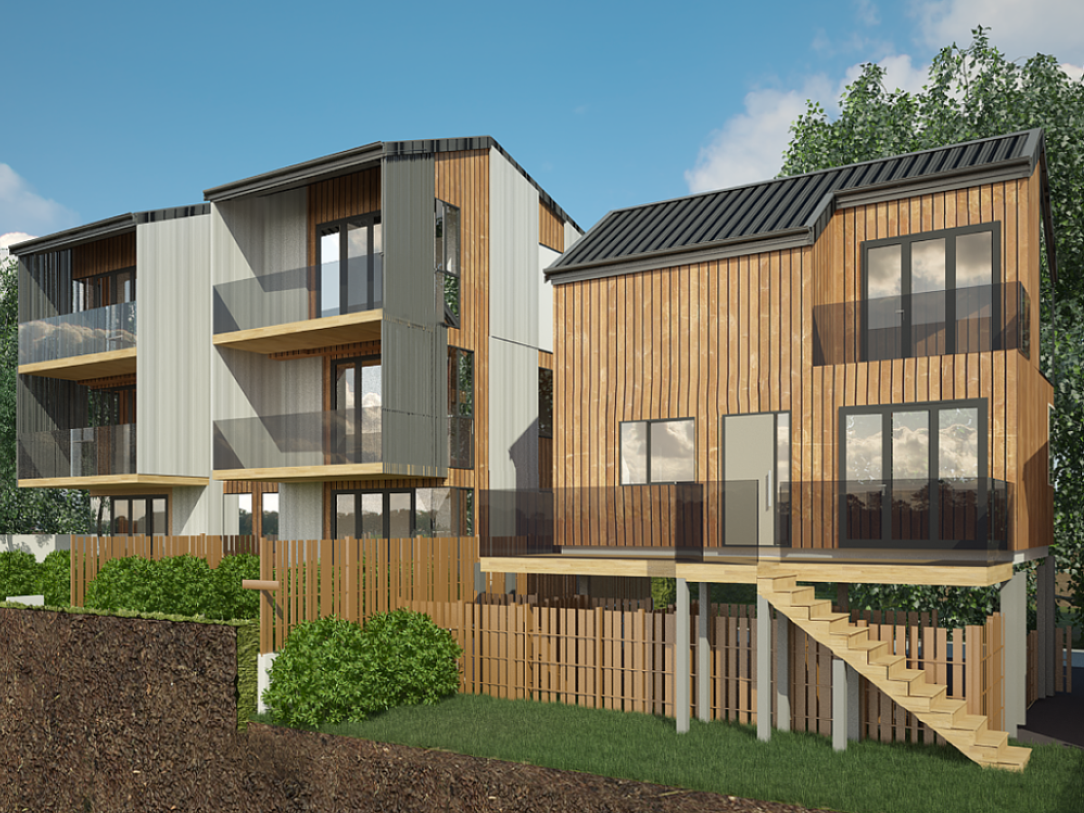
The best way to use the land, which is on a slight incline, was to move the existing house to the front of the section and lift it. We kept the existing house upstairs as a three-bedroom home, and added two units below it – one is a one-bedroom, and the other is a two-bedroom unit.
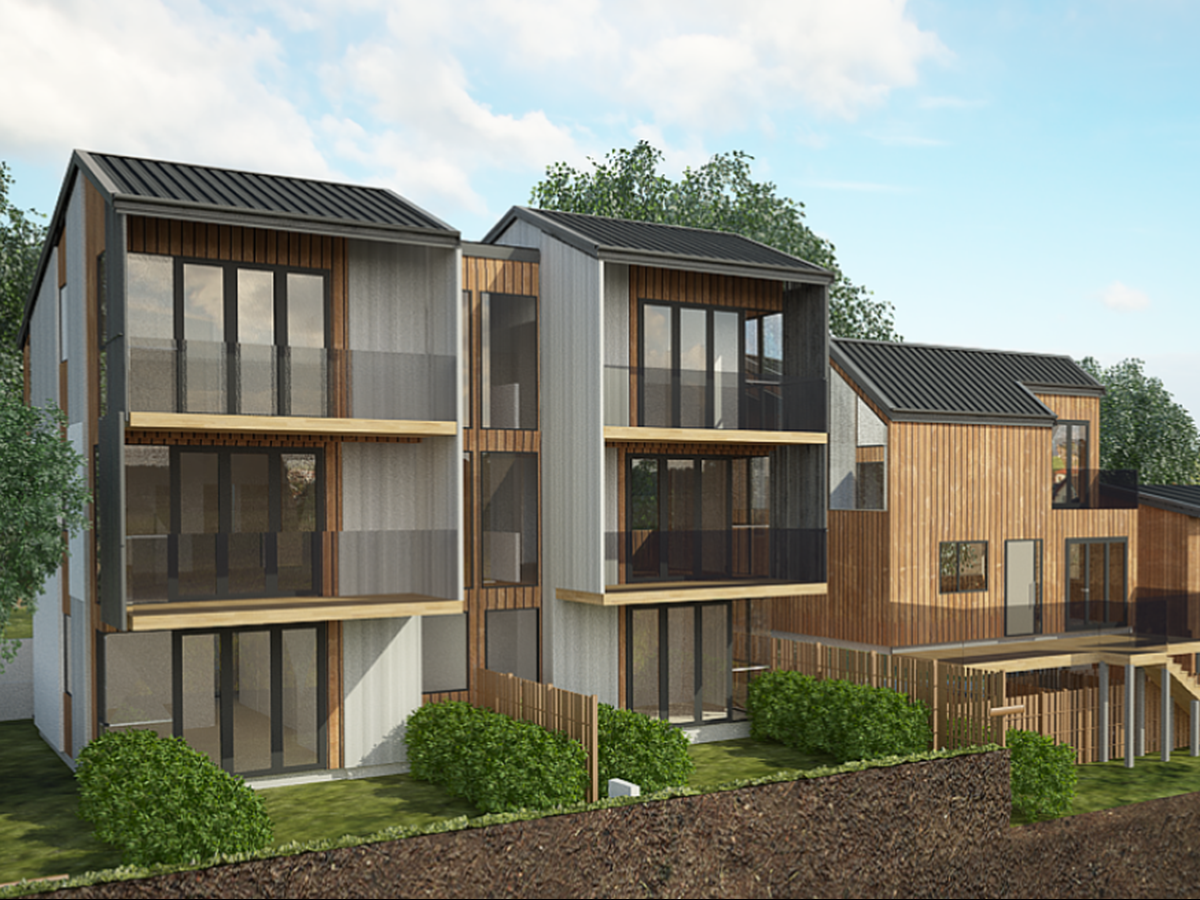
We then designed a new three-storey block to be built on the back of the section. It would consist of four new homes, split vertically, with two on each side. The units on the ground floor would be one-bedroom units, with lots of storage and large, north-facing gardens. And the upper levels of this block would be two larger homes, consisting of three-bedroom apartments. Over level one of these, we have the living/dining/kitchen, a guest toilet and a north-facing deck, while on the upper level we have three bedrooms and a north-facing balcony. For all of these units, we created several opportunities for outdoor living spaces and ample sunlight.
With these initial designs coming together, we worked on ideas for how to tie it all together. What started as something we suggested for practicality soon turned into a wonderful design feature. Having designs underway for what would now be seven homes on the section, we needed to address the issue of parking. When we looked at options for multiple driveways and several off-street parking spots, we knew we needed to find a better solution. Driveways and parking spots are, after all, just unattractive concrete features on most sections. Because we were working with a sloped section, multiple driveways would mean a lot of expensive digging and retention work.
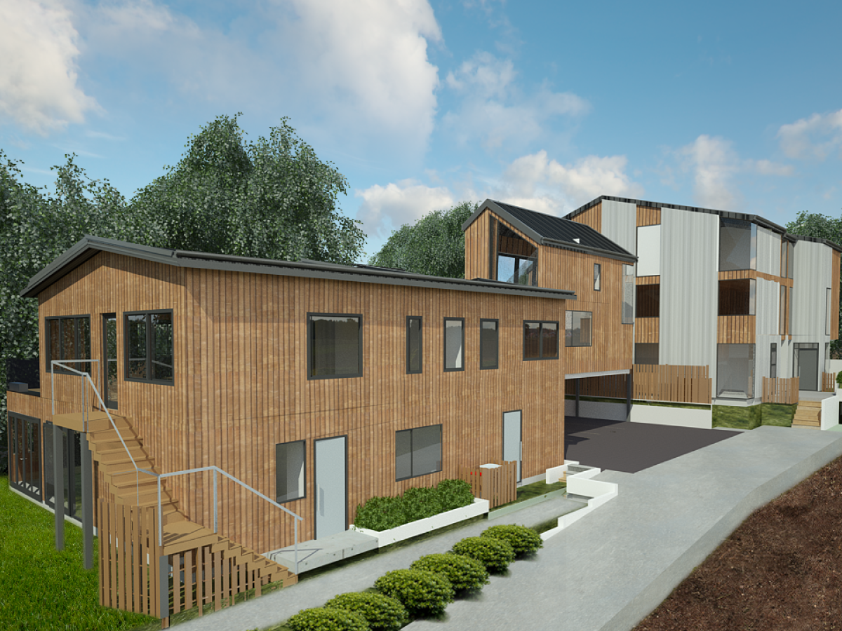
Our solution was to create a central parking space – known as satellite parking. This would minimise the need for several driveways and turning circles, as well as reduce the impact on the stormwater system.
Having the parking area in the middle of the section – between the two buildings – also meant that we could stop the driveway halfway up the site and make better use of the land in the back and to the side.
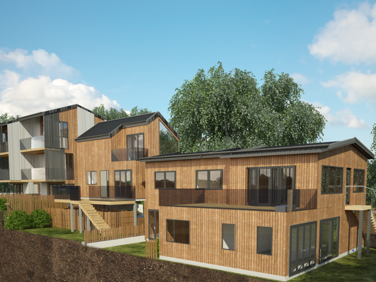
The parking area is single storey, so our creative minds could see the potential for putting another unit on top of it. Following the contour of the land, we designed a generous 70 sqm, two-level unit here that consists of one bedroom plus an office. Being north-facing, we gave it a large 20 sqm deck downstairs, and a smaller covered private deck upstairs off the bedroom. Not only is this a great use of the central block, but it is a crafty way to tie everything together, bringing together the old and the new.
The most challenging and yet most rewarding part of this project was how to tie together the design elements of the development – the older home in front, the new units being built and the parking bay. With three distinct parts on an elevated section, we used a gradual design transition from old to new.
The building in the front maintains the lightweight timber design of the existing house, while the one in the back is a modern mix of newer vertical cladding, pre-cast concrete, recessed balconies and offset roofing. The structure in the middle ties it all together with features from the old and new that sit really well together – lightweight timber framing, vertical timber cladding and an offset roof.
Paying attention to the gardens and accessways, we wanted this to appear as a set of neighbours living in a beautiful new development, rather than apartments sitting side by side. So we designed an inviting entrance on to the property. As you approach the building, you see purposeful landscaping and in-ground lighting that separate the footpath and the driveway. You feel as though you’re approaching a community, not just a group of apartments.


