We wanted to create a large, open-plan living area that looked out over the water where the family could enjoy each other’s company and the sea views. With this type of design, it’s important that we also maintain some privacy and include spaces where people can go for a bit of quiet time – always essential in a large, family home.
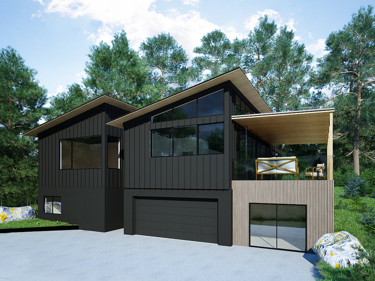
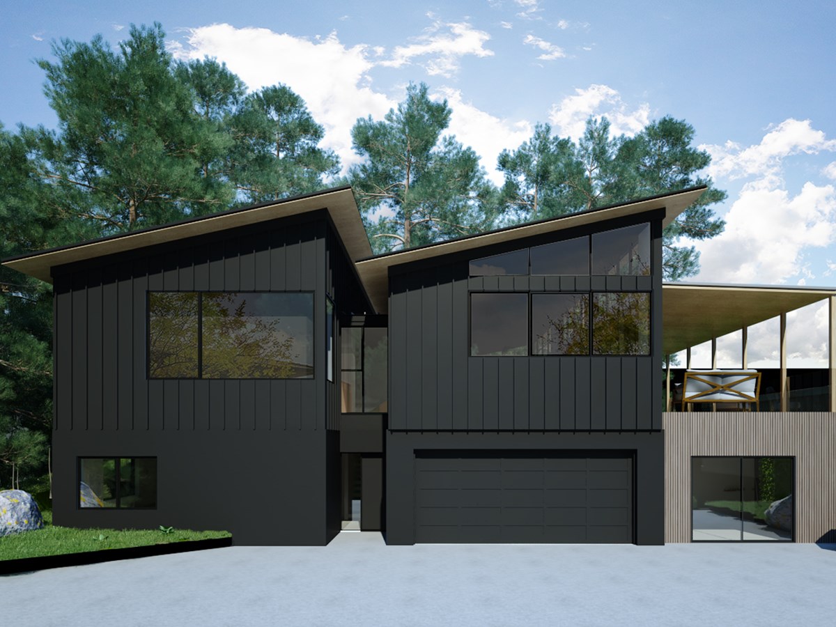
We achieved this balance by incorporating what we refer to as public and private zones. The public zone is where we have the kitchen / living / dining areas, and the private areas include the bedrooms, nooks, bathrooms. Both zones have high ceilings and high-level windows, and a recessed entryway sits between the two sections of the house.
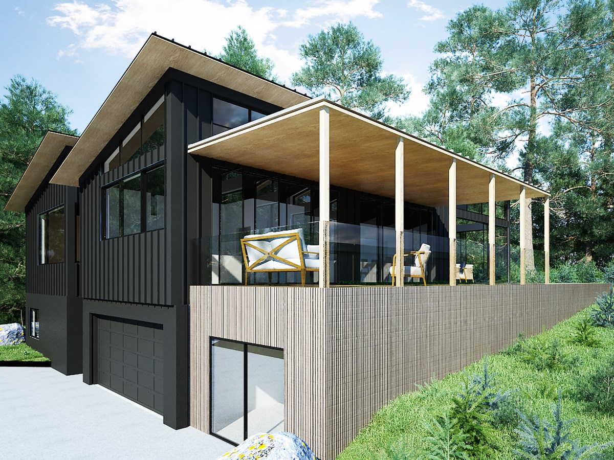
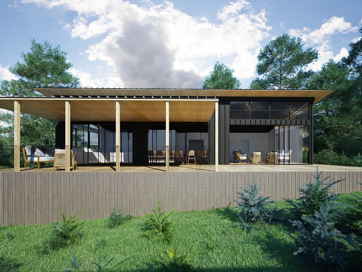
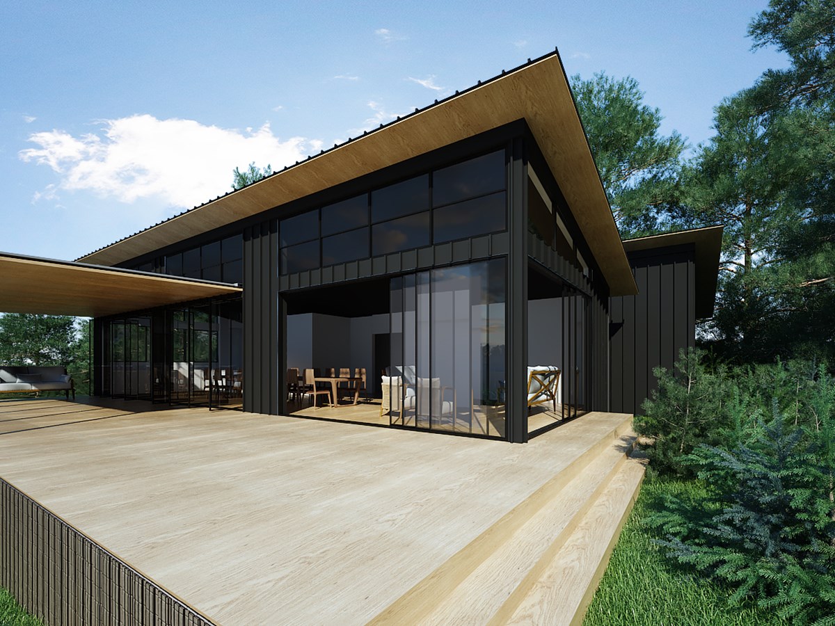
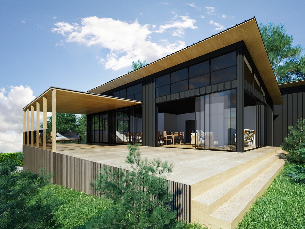
It is from the upper level where you can enjoy the views to the north and the east, so it was here that we found the natural spot for the outdoor living area and the open plan entertaining areas. The house now has a large open-plan kitchen and dining area, and just outside, a covered deck runs along the entire length of the house. The deck area has a timber “ceiling” that sits about three quarters of the way up the eastern side of the house, with windows extending above this. It lets us create a protected outdoor space without blocking light into the house.
The result is that we have high walls and ceiling height created by the two mono pitch roofs, a long covered outdoor area, and high level windows that allow plenty of light in that bounces off the ceiling and brightens up the house.
Also on the upper level of the house we have the master bedroom with a walk-in wardrobe and ensuite bathroom, two other double bedrooms, and a full family bathroom.
On the lower level there is another bedroom and bathroom, and the garage. Most of the living has been designed for the second level, where we’ve made the most of the views and the sunlight, but there is still plenty of spare room downstairs.
The design materials we used complement the natural surroundings beautifully. Using folded metal cladding on the upper level of the house has meant that we’ve been very calculated about the location of windows, ensuring we have clean lines and symmetry where needed.
Our clients like the exposed timber look, so we’ve carried it throughout the design to the outside and the underside of the roof where the soffit is, opening the house out to nature. Some vertical timber cladding on the lower level provides a soft contrast to the lines of the upper level cladding and ties in beautifully with the deck and exposed ply.
Overall, we’ve kept the form quite simple with subtle details, and have been very intentional about where we’ve opened the house up and let the light and views in.

