With these very clear requests, we set about designing something that makes the most of the size and position of the section. We’ve created a spacious single-level family home that faces the water, along with a smaller home on the street/driveway side of the section that will provide rental income.
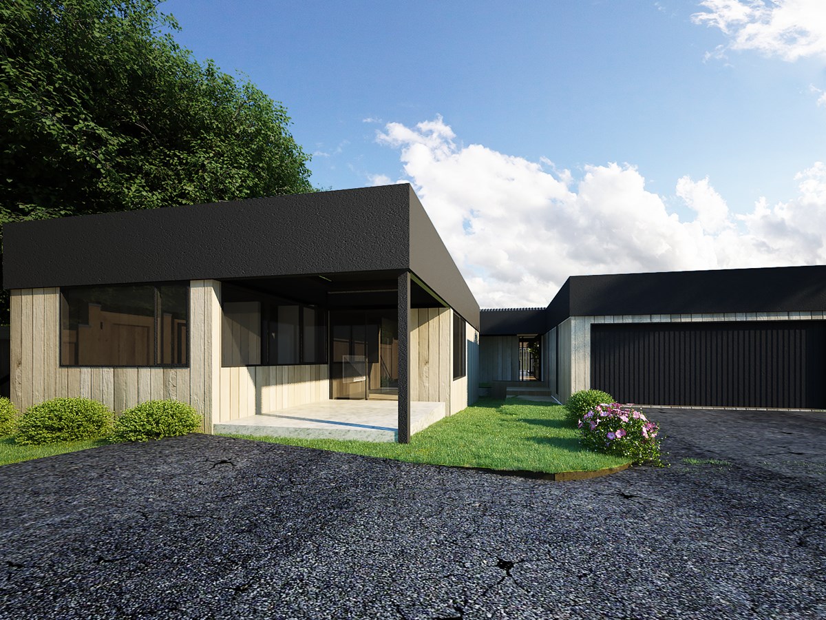
The minor dwelling is a two-bedroom, one bathroom house with a private courtyard. As you approach from the street, this smaller home is on the left, completely separate and facing away from the larger family home. There is a walkway that separates it from the main house and double garage.
Leading down that walkway, you approach the large pivot front door of the main dwelling, with little indication of what lies beyond. Once you enter, however, you are immediately greeted by incredible views of the water from almost every point inside the house.
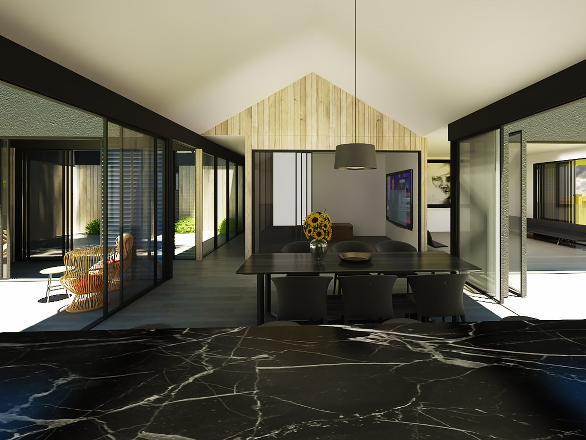
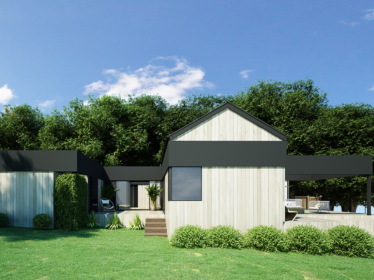
As you walk in, there is a large central gable that houses the kitchen, scullery, dining room and media room. With glass on both sides, the gable protects the occupants from the weather, while providing views out to the water without them feeling like they’re on display. The media room can be closed in by sliding doors or opened up to form part of the kitchen and dining space. A bit further beyond, on the left, is a living room/family room.
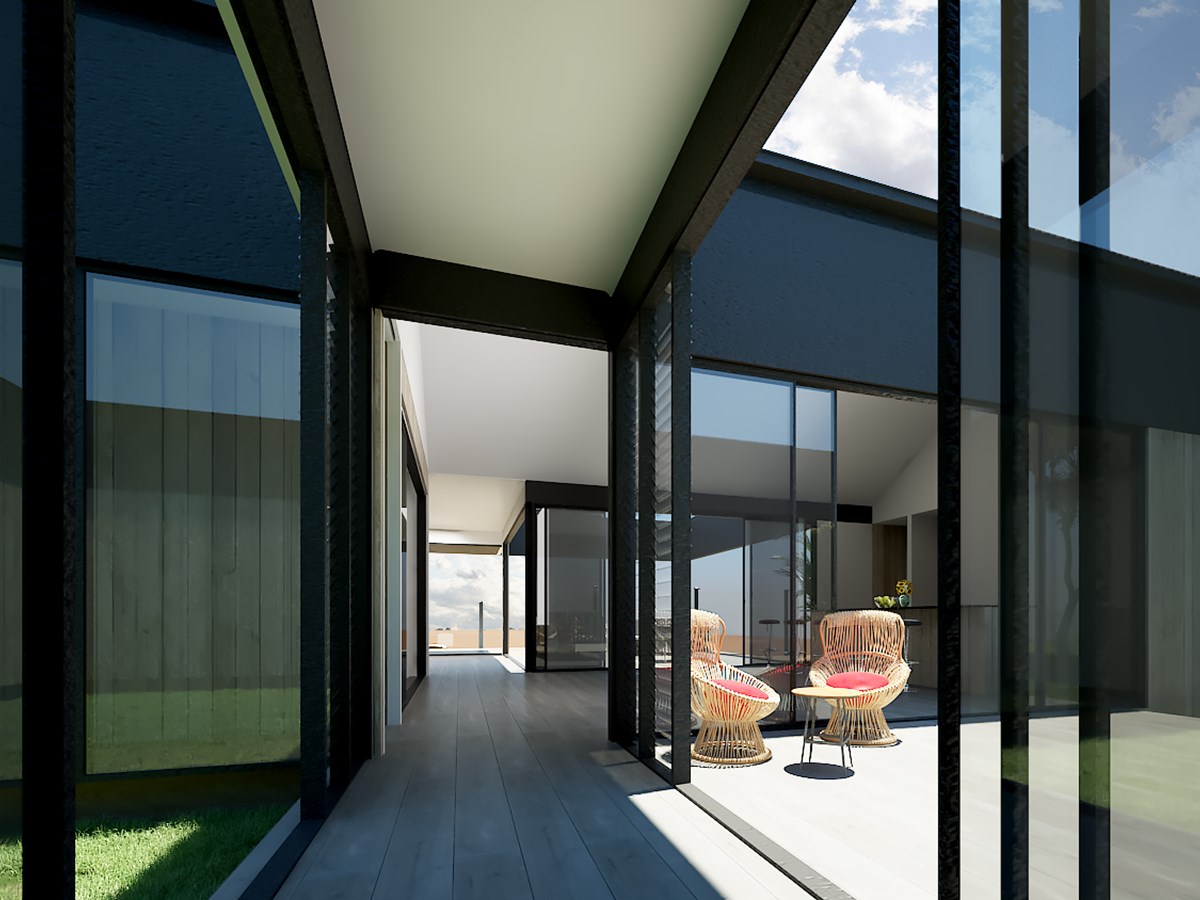
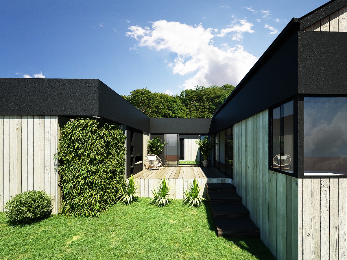
Walking down the hallway on the left of the centre gable, there is a courtyard that lets a lot of light into the house, while providing a bit of separation for the private areas of the house. The hallway leads to the bedrooms, bathrooms and a master bedroom at the end with a waterfront view.
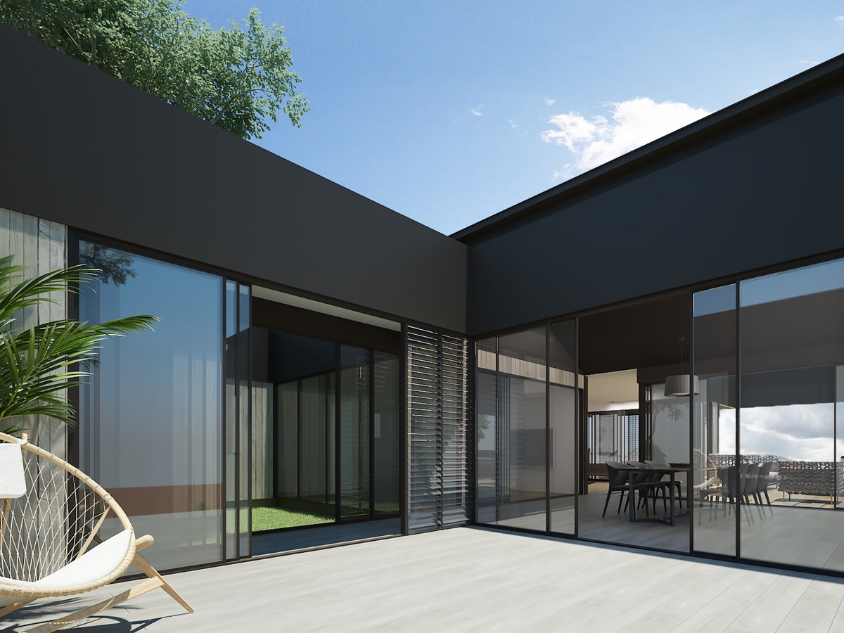
On the other side of the centre gable is a decked courtyard that faces east to receive the morning sun. Over the course of our work with our clients we began referring to this as the winter garden because of its cosiness and outdoor fireplace.
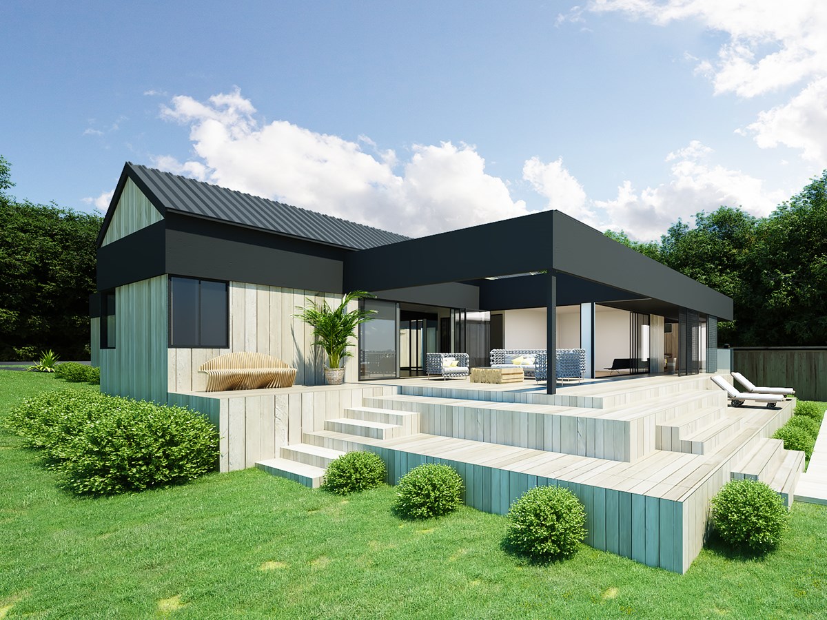
Passing through the centre gable and out to the waterfront side of the house, we’ve designed a large wrap-around deck to provide great views out to the estuary. We needed this deck to be three metres above ground because of sea level rises, so we added in a gentle step-down that provides an additional seating area.
We paid particular attention to the building materials in our plans in order to create a design that has smooth transitions between living areas and that blends in nicely with the natural surroundings. We used a simple palette for our colours and textures, using solid timber, wide board cladding that has a very natural feel to it. We offset that with dark joinery and dark metal spandrel that frames the overall silhouette of the house. High ceilings and full height joinery provide incredible views and allow for a lot of sunlight into the house.
We carried the timber cladding inside through to the gable end, with the soffit continuing outside. The result is a sense that the outside structural elements are a continuation of the inside space. The desired effect is a blurred line between inside and outside, perfect for a family that enjoys entertaining and sitting out enjoying the views.
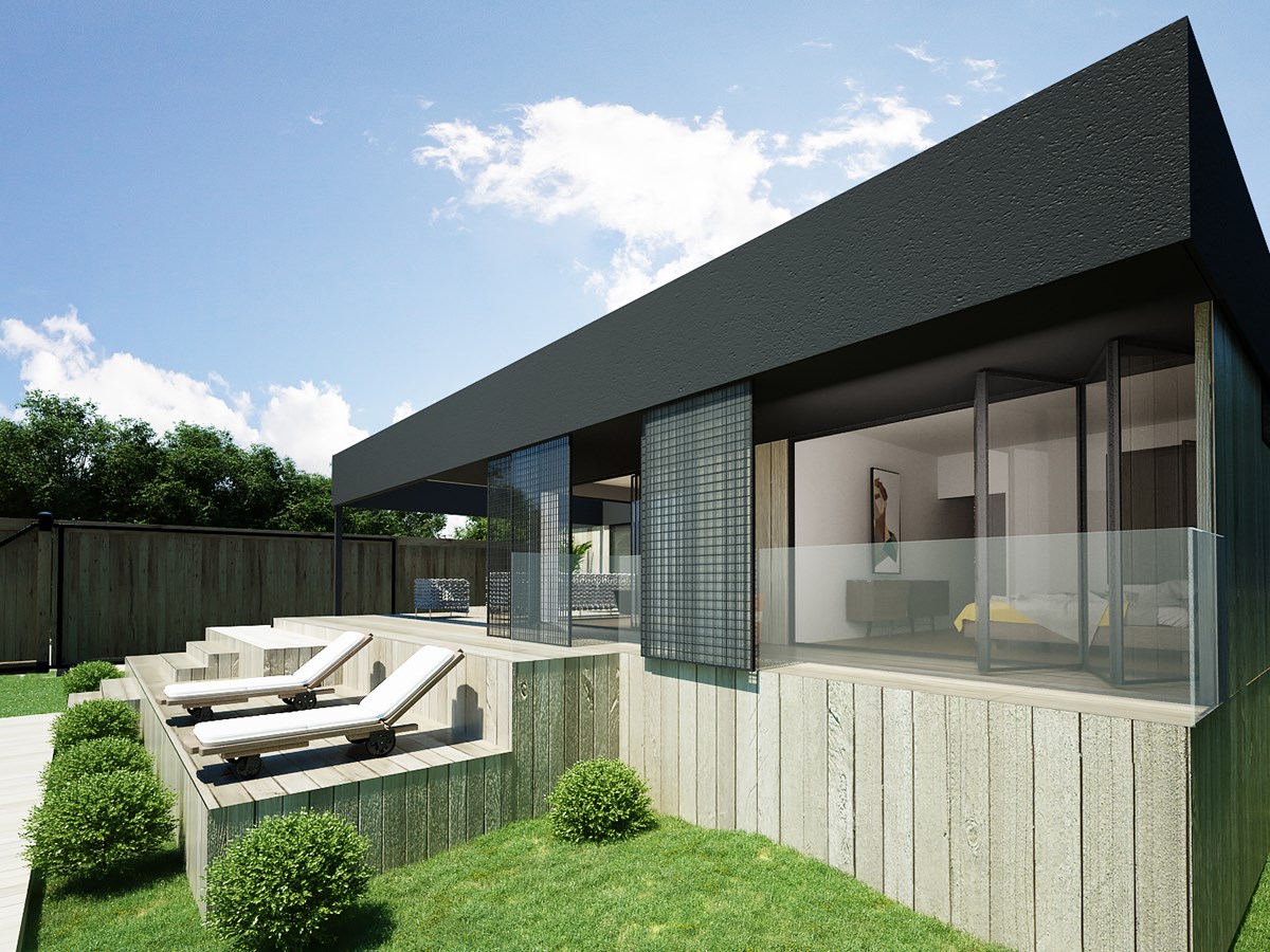
While we wanted to allow a lot of light into the house, we were also mindful of providing flexibility around how much sun to let in. The master bedroom and the family room have an overhang that creates a bit of shade from the western sun. There are also prefabricated metal screens that can be pulled to provide extra shading in the summer months, or extra privacy in the evening, without having to fully pull the shades for privacy.
Sliding doors throughout provide the homeowners with several options of how much to open up the house to the courtyards and the deck. Knowing that the family enjoys having people around to visit, we wanted to make sure that they had at least a couple of comfortable outdoor areas as well as entertaining zones inside. The house feels like a big holiday home – one that they get to live in every day.

